Friday 27 March 2015

Band Merchandise

We chose to put our merchandise on clothes as many bands from our genre do so. The merchandise was then put on my individual website on the websites shop page. The merchandise offers the fans to feel closer to the band, lets them feel distinct and different from the rest and declares their like for the band band to the public or anyone who sees the t-shirt.

Band name

We chose our band name to be The Fiction as we wanted to be seen as a group, we therefore decided to be ''the'' something. We chose the fiction as it fitted around our song and the idea of reality that was explored in our video. The name is also simple and easy to remember and therefore will stay with people.

Live Performance

Live Perfomance:
To film the live performance, we filmed in the studio, using lights and instruments with a cameraman. The live performance was compulsory for our music video, as we discovered through our audience research, as it offered credibility to our band. I had to mime and Matt and Jono had to pretend to play guitar, which brought about its issues. I brought in speakers, which played out the music out loud so we could play along in time to it and we played through the song several times, with a camera walking around the studio filming us from different angles. When we uploaded, we used the best footage and put them on our video.

Final Link

Here is the link to my final website: http://sam8green97.wix.com/thefiction

Website Shop Page

I have created a page that sells merchandise (all clothing) of the band, which enables the fans to buy products of the band. The layout of the shop is basic and the items and its prices are easy to see, offering no confusion to the audience. The merchandise offered is clothing aimed towards our target audience, which is the young male adult, such as jumpers and t-shirts. I have also offered a jumbo pack for those who want tobuy all the products at a discount price.


Website Contact Page

I have offered a contact page for the fans to sign up to receive an exclusive newsletter on the band and to be kept up to date on the bands latest activities. On this page I have offered a name, email, subject and message box for the audience to fill in.

Website News Page

My Website contains news about the artists, as do most music websites and contains information on their next concerts and festivals. The news page updates the fans on the latest events involving their band and lets them know where the bands are playing, as listed in my news item. There is also a news update on news f the band announcing they will play Reading and Leeds festival which has a band members thoughts on the news as well as information about who is playing at the festival.

Website Photos and Video Page

My website offers a page for people to look at photos of the band and see behind the scenes, bringing them closer to the band and developing intimacy between the band and audience. There is also a link to the music video from this page directing the audience to the music video we filmed. There are a variety photos and contain photos that would not be seen on any other platform.

Website Music Page

My website offers free samples of music to listen in order to promote the bands current album. I have chose music in the same genre as it will be recognisable to fans of the genre as well as show the bands respect for the artists, therefore gaining respect from fans of who's music is being promoted.

Website Homepage

My website homepage follows the conventions of music websites by having the latest news about the band along with info about the bands next gigs. The page also has pictures of the band along with their latest music video. The big pictures of the website were largely i fluenced by Oasis' website as I felt the pictures were imposing and stood out. The website contains links and and samples for viewers to listen to. The options are clearly laid out making the website easy to navigate and easy to use. I chose a similar font to the font that I chose for the digipak as I felt it matched the image of the band.
The website also offers a link to social media accounts such as facebook, twitter and instagram at the bottom of each page.


Website Review

Oasis Website
Oasis' website follows the conventions expected of the genre, however differs from many, as the band are not now together. As the band are not together, the website is not updated as frequently as one of those that focuses on a band that are currently together however due to reissues and anniversaries there is still content to be put up for the fans. The band not being together increases a focus on their history, the websites involves pictures and and information on previous gigs. The website follows conventions by including an on-line shops, forums, videos, press videos, news etc. The big pictures of this website that stand out is something that I will try to replicate in my website.

Thursday 26 March 2015

Audience Feeedback to Final Film

The audience feedback received was good. The filter of the older footage was praised along with our choice for location. Both the scenes outside and the studio were praised and the video was seen to look "very proffesional" which was very encouraging.

Final Music Video

Final Music Video

Digipak CD

The Digipak here again follows the themes of the rest of the digipak by having the effect of the colour and the blur. The bands logo is included on the CD along with the three members of the band. The CD and the background template are the same, which again creates a sense of continuity. The photo is from the setting of the video and has the famous Brighton Pier in the background, which shows will evoke memories of the video as well as any personal memories if they have been to Brighton. We wanted to have picturesque backgrounds for our digipaks and that is one of the reasons we went to Brighton.

In the song it refers to the past being  better place we went to Brighton as it has picturesque landscapes and therefore shows the brilliance of the ''old days''.

Digipak Middle - Lyrics

The middle of the digipak contains the lyrics, as many albums not just of the indie rock genre do. The photo contains the blur effect again, which runs throughout the entire the digipak as well as the colouring of the photos. The writing of the lyrics of the is in the same font used throughout.

Album back cover

The back cover of my digipak follows the forms and conventions expected within this genre. The back cover contains the order of the songs of the album (all of which are by The Strokes), the record label, the band log, the rights and the bar code. The albums colour has been edited along with the blur effects to create the continuity with the rest of the digipak. The back cover is another pose and shows the band in a different location and offers a change from the front cover.


The band pose on both the back and front cover, much like Oasis' Definitely Maybe, which influenced me greatly on where to put the photos regarding the position on the digipak. The Oasis album has the band again at the same location of the front, doing a different pose with the band members positions mixed about with different people enjoying more/less focus. Our cover has the band members mixed up and different members have more focus.


Digipak front cover

The front cover of my digipak is colourful bright and stands out as well as being a reference to the 1979 film Quadrophenia, which our music video tries to recreate the themes set in the film. The intertextuality will flatter those who get the reference, as well as remind those of the themes set in the Quadrophenia film. The front cover is of the band posing down the famous alley way, used in the film and creates intimacy between the band and audience. The cover of the digipak carries over the theme of reminiscence set in the video by not only referencing a film made 36 years ago, that is itself nostalgic of events in 1964, but by the colours used. I effected the colours by altering the curves and focused on bringing the red and orange colours out of the picture to create the ''super 8'' look, which runs throughout the video. The font I have used in is imposing and fades away, matching the theme of the video. The blur also creates a theme of reflecting on time, which is again a theme developed in the video. In the cover we also use the bands logo again for reiteration of the bands name as well as promotion for the merchandise.


My digipak has taken influence from Oasis' Definitely Maybe cover, with the effect on the colours and brightness of the image. This cover is more natural than, as in mine the band are posing, however the colours and the togetherness of the band are reiterated in our video.

Conventions of Music Websites

Websites are used to promote and to sell the band they are advertising. Conventions of websites include:
  • The logo will be clear and the bands name will be clearly displayed, to let the audience know who the website is based on.
  • There will be merchandise advertised that is purchasable online.
  • There will be photos of the band throughout their history.
  • There will be the dates of upcoming events such as festivals and concerts that the band will be performing in.
  • There are sometimes a brief description of the bands origin so that people can become familiar with the roots of the band.
  • The website will advertise new singles and albums, as well as old ones.
  • The hyperlinks will be laid out in a way that is clear to see and easy to use.
  • There will be sample music of the band as well as a music video and the website could promote other bands within the same record company.
  • There will be an opportunity for the audience to sign a subscription with the band.
  • There will be message boards, which offers the fans a chance to talk about their band.
  • As well as this there will also be news feeds, updating the audience on the band/artists current affairs.

Difficulties with Photoshop

I found it difficult to use Photoshop and found myself watching many tutorials to get the most out of the software to help me make digipak what I wanted it to be. As this was my first time of using Photoshop, it took me a while to get used to the programme and lead to me spending a lot more time on the software than I would have if I was used to it. The software was only available to me at school which also meant that I could not access the programme at home and, again made the process more difficult, as I could not take it home.
Here is an example of the kind of tutorial videos I had to watch to grasp the concept of Photoshop.

Font

After looking through many fonts on Dafont.com I chose the the Press Feeling Eroded font, as not only did I feel that it would match the conventions of my genre and the expectations of the fans with its grittier more realistic feel, but the font matches the themes shown in the song we chose to use. As the letters are eroded and are fading away it gives a sense of realism as well as represents the past fading away, which was a theme developed in the song. I also chose o captialise the letters of the front cover on my digipak, as I felt that was imposing and matched the image of the band, as well as the fact that I felt it would stand out to the general public.


After downloading this font I applied it to the photos on Photoshop and edited it as instructed in the tutorial video.


Photoshop - Blur

I chose to use the blur effect to emphasise the focus on the band and to follow the themes of nostalgia and reminiscence shown in the video. After watching the video I applied my knowledge on Photoshop to create the blur effect.The blur I used was radial blur, which created a sense that we were going back through/reflecting time, a theme that was developed in our music video through the shots of the band in reverse.


Photoshop - Curves

I wanted to replicate the curves used in our video on my digipak to recreate the ''super 8'' look we used in our music video. To do this I watched the tutorial and aimed to bring out the colours of the picture. The main focus was however, to make the picture bring out the reds and orange of the pictures to create an archaic feel to the images, similar as we did with the video.


Wednesday 25 March 2015

Website Review

The background of this website is the same of the Strokes' latest album in order to promote the album. The Stokes' logo is clear and shown in several places on the website, it is easily visible to let people know who the website belongs to. The layout of the website is simple and follows the conventions of a music website by including features such as the bands next events, photos of the band, news on the band, the opportunity to buy albums, tickets, singles, records and merchandise. As well as offering a forum for the fans to discuss the band, their albums, concerts and express their views.
The Strokes website homepage
The website lays the photos out clearly and the hyperlinks are clearly show, making the website easy to navigate through. The bright colours of the album stand out to attract the attention of the audience. The album is easily purchasable and stands out which is market tool to make it easy for people to buy the album.

Tuesday 24 March 2015

First shoot - What we learnt

Our fist time filming was in early January 2015. We used the appropriate equipment and after we finished filming and uploaded the footage onto our mac we saw our mistakes and discussed how we would fix them next time. One of the mistakes we made was using too many lights as when we viewed the footage we could see that it was too bright for viewing. To correct this we decided to use fewer lights in order to create a darker more realistic feel for the live performance. We also found that the shots we used were too similar and that we would not be able to use a tripod to film all of our shots and that we would therefore need a cameraman/woman. As well as this, it taught us how long each filming session would take and made us more prepared in the future for time planning.

Thursday 19 March 2015

Live performance

In most Rock music videos, there will be a live performance from the artist due to the expectations of the audience and the expectance that comes with the genre. Due to these expectations and the expectations of the three people we interviewed, we have chose to have a live performance in our drama studio and use the instruments typically used for rock music videos. People will expect the performance to be convincing and we will have to therefore act enthusiastically to add realism to the video and create a better connection with the audience.

Influential Music Videos

Dirty Pretty Things - Bang Bang You're Dead
In this video the we see the expectations of fans of the rock genre and of ''Dirty Pretty Things'' are met with a live performance, multiple close ups and shots of the whole band. The editing of this video matches the pace of the song, with the cuts being fast and matching the rhythm of the song. The fast pace of the editing feels aggressive and matches the guitars being strum which makes the video suit the violence of the song. There is no real narrative in this story and like we wish ours to be, the video is driven by events that match the theme of the song, with this videos theme being resentment and ours focusing on past relationships and nostalgia.
This video has influenced us by making us wasn't to replicate the editing which is in rhythm with the song and creates a better looking more atmospheric video.

Audience Research

Through our audience research,we learnt what fans of the genre would expect and like to see from a music video. We found out that they would expect to see a live performance from the band, featuring the standard instruments of a rock band such as guitar, bass guitar and drums. We were also told that the performance should be energetic and reflect what the song is about. As well as this we received mixed opinions on whether the video should be light hearted or focus on serious themes, with our audience giving us different feedback. The audience also stated that they expect to see the energy from the live performance carried over to the narrative.

Intertextuality


Red Hot Chilli Peppers - Californication
In this music video, many different types of video games are referenced. For example throughout the music video, many different genres of games are referenced sports, motor sports and open world games, which epitomizes the mood of the song and the games of the 90s. These references will flatter the audience who understand and will make a further connection between the audience and there fans.

Outfit ideas

Studio
We wanted our outfits to remain simple and be something that we would wear in an everyday environment. This was to show that the band is similar to its audience in order to create empathy between the two. I felt that jeans and a shirt or a t-shirt would be appropriate. The outfits that we chose can be seen in the picture below.

Brighton
We again felt that the clothes we wore were something we wear every day. Due to be it being a cold day we had to wear coats and jackets, which we felt were appropriate and added realism to our video. Our outfit for the shoot in Brighton can be seen below.
Clapham Junction
I wore a casual suit in this shoot to imply that the times have changed, matching the themes of the song.

Problem we faced when filming

Studio
Due to us filming with expensive equipment in a studio that is often in use and us needing a cameraman/woman, filming the live performance was tricky to arrange. Although to arrange filming was tricky, we did however manage to film on six different occasions. On each of these six occasions we would have to wear the same outfits and I would have to bring my guitar and amplifier. As I could not always bring my guitar and amp, this meant that we could not film at anytime. The drama studio was also often busy and therefore we had to book our time of use well in advance. We also had to borrow a guitar, an amplifier, a microphone, drums and a microphone stand. This again was not always convenient and there was an occasion when there was confusion with the drums and the drums we used in a previous shoot were not available and we therefore could not film. We also had to borrow the camera and lights, and on one occasion the camera did not work, which was another time where we didn't get any footage. As well as this we needed a cameraman/woman every time we filmed as the original shots we used on a tripod were not interesting enough, meaning that every time filmed there had to be someone filming who we instructed.

Problems we faced when filming

Brighton
We encountered many problems when filming due to the equipment and locations used. For example, when we went to Brighton, we had to make sure we did everything on that day because Brighton is 50 miles away and the cost of getting there is not cheap. We knew we could not reshoot there, which made us re film footage in case there was a problem with any of the footage. Unfortunately when we uploaded the footage, there were a few clips that were not able to be uploaded and therefore we could not re film as the footage was in Brighton. However as we filmed each shot twice, we had back ups and therefore were not effected too greatly by the error.

Influential Album Covers

My Generation (1965)- The Who
This album cover shows the whole band and establishes the themes set by the Who and their songs. The picture of the band gazing skywards has led to many other artists such as the Jam and the Undertones. The album also references the British invasion of the time, with John Entwistle, holding a Union Jack flag around his shoulder. By having all four members look in the same direction, the album cover depicts the band as being one, which is something that we will try to replicate in our album cover.

Influential Album Covers

Up the Bracket (2002)- The Libertines
The cover, which is an image taken from the riot in Argentina during their economic crisis between 1999-2002. The bands debut album cover shows their attitude and their rebellious attitude, distinguishing themselves from other bands. They also came onto the independent scene with a new style of music the picture of a riot represents a revolution in a new style of music and a transformation in the ''indie'' music scene. It is the shocking nature of the album cover that has made it an inspiration for my digipak.

Inflential Album Covers

 Nevermind (1992) - Nirvana
Another iconic album cover that has been parodied a numerous amount of times due to its controversial image. It is due to the contentious nature of the image, which has sparked much debate, that the album has become as famous and recognisable as it is today. Again similar to ''The Queen is Dead'' this album covers shocking and controversial image has inspired us to do something different with our digipak


Influential Album Covers

 The Queen is Dead (1986) - The Smiths
The Queen is dead reciprocates theme of the controversial album name with mystery in the cover and brings its target audience. The dark colours also represent The Smiths as they would often sing about more serious themes than other musicians of the time. The cover is taken directly from ''L'Insoumis'' which references 1960s movies as well shows their admiration for the cover star and genre of film. This album cover is shocking and sets the tone for the rest of the album, which has inspired us to make a digipak with related themes to the band image and the song it is selling.

Influential Album Covers

The Rise and Fall of Ziggy Stardust and the Spiders from Mars (1972)- David Bowie
This album cover presents David Bowie as his alter ego Ziggy Stardust by the use of lighting. The lighting makes it seem as if Ziggy Stardust has been beamed down from another and fits the theme of the album title. The album also helps create the persona of Ziggy Stardust by making himself obscure which creates a mysterious element to his character. This album cover is again unique and has inspired us to create a digipak that is not normal and that follows the themes of the artist.


Influential Album Covers

Definitely Maybe (1994)- Oasis
The album cover of Oasis' debut album establishes the band and creates an intimate feel as it lets in the audience into one of the band members home, which re-enforces the image that Oasis were trying to create at the time of them being the same us and creates empathy between the audience and the band. There are also references to other bands and their interests such as football, which gives the audience a greater understanding of the band. The album background was rebuilt in 2014 in the 20th anniversary of the album, offering fans to put themselves on the album cover. The personal feel of this album cover has inspired us to create intimacy with out target audience as this album cover perfectly does.

Influential Album Covers

Abbey Road (1969)- The Beatles
The album cover of Abbey Road is seen as one of the most iconic album covers in music history due to its simplistic nature and the fact that it can be easily imitated (which it has many times by the Simpsons, the Muppet's and South Park as well as others.) and due to the fact that it created a conspiracy theory. The album is the swansong of the Beatles and the spot where it was taken has become a shrine to their fans.This album cover has inspired us to have a shot of the band all together in the same direction which creates a sense of togetherness.


Editing

The pacing of editing in music videos depends on the pace and the themes of the songs. For example wit the David Bowie song ''heroes'' the editing is slow and there are very few cuts. The editing goes with the rhythm of the song and works with the song.


Whereas with Dirty Pretty Things ''Bang Bang You're Dead'' The pace of the song is fast and therefore the editing is fast and there are many fast cuts which create momentum and again works with the song to create momentum for the chorus.


Wednesday 18 March 2015

Record Label

We chose our Record Label to be Warehouse records, to recreate the gritty themes of the bands it represented. In particular, we drew inspiration from the Manchester based company ''Factory Records'' who were influential in the 1980s and represented bands such as Joy Division and Happy Mondays.

Influential Album Covers

Sergeant Peppers Lonely Hearts Club Band (1967) - The Beatles
The Beatles Sergeant Peppers Lonely Hearts Club Band has an iconic album cover and is largely recognised. The album cover depicts several dozen celebrities, including different political figures. This album cover reflects the change of style of the Beatles music and of their appearance. Through this album they separated themselves from being a pop band to establish themselves as an experimental band who were experimenting both with music and drugs. The album cover helped progress them to a psychedelic rock band. The iconic nature and its uniqueness of the album cover has inspired us to do something different with our digipak.

Band Logos

The Rolling Stones Logo
The Rolling Stones logo is instantly recognised all over the world and has become an icon in popular culture of Rock 'n' Roll. The ''tongue and lip'' created by John Pasche represents the band and was created to encapsulate Mick Jaggers big lips. The pop art was also used to chow the bands rebelliousness with the tongue being stuck out representing a disregard for rules. The logo could be argued as the most innovative logos ever created and the Rolling Stones have used it for their merchandise and albums ever since its creation in 1970.

Music Video Research

David Bowie - Heroes
This David Bowie single of 1977 was made into a video which focuses primarily on the performance of the artist and has him in the spotlight singing. The first 80 seconds we can see there are no cuts and the camera used establishes the setting, then zooms in and around for closer intimacy with the artist. The shots used for the performance are simple and the video is reliant on the performance to entertain the audience, which it does. The other shots are also close ups of the artist, offering more intimacy between the artist and the audience which creates a relationship between the two. The shots last a long time which creates the sense of the performance being live and therefore will please fans of the rock genre, who this video is aimed towards.

Tuesday 17 March 2015

Digipack review

The Beatles - Revolver
The Beatles 1966 album was reissued in 2009 in digipak form to allow for more artwork to be given to fans.

Front
The front cover contains the album cover designed by the band, which reflects the feel of the album.

Middle
The digipak opens two ways allowing for a greater amount of artwork to surface.

Back
The back of the album shows the track listing as well as the record company and additional information of the band. The back differs from the front cartoon drawings as it features a photo of the band, however it is again in black and white. The contrasting nature of the two pictures show how the songs of the albums are not the same and that the band have the ability to adapt.

Book
The book contains lyrics as well as photos of the band as well as other artwork designed by the Beatles.

CD
The CD is a copy of the front cover which reiterates the image and the themes created from it.

Band Logos

Band logos offer artists to express their themes and attitude through an image. These logos are often put on the artists album as well as on their own merchandise.


Nirvarna
Nirvarna's band logo expresses their childlike attitude which contrasts with their dark themes of their songs by using a bright yellow ''smiley face'' in front of a black background. Th bright yellow represents  joy and energy, whereas the black represents power and fear. This logo is instantly recognisable to fans due to its uniqueness and has been parodied in American culture many times due to it standing out.

Digipak review


Chasing Yesterday - Noel Gallagher's High Flying Birds

Noel Gallagher's High Flying Birds second album was released as a digipack from Sour ash Records Ltd in 2015 and features the conventional codes of a digipack.
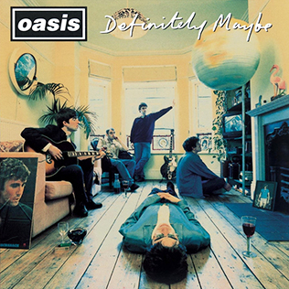
Front
The front of the album is a mid shot of the artist and has the album artists name in the background. The front cover is plain with Noel in the spotlight, which shows that although he is at the centre of attention he has calmed down due to age.

Middle
When the digipak is opened and we see the gate fold image, we can see two different pictures of the same man, who is not identified on the album and who we assume has something to do with the producing of the album or the record company, looking at the camera. This could be there to suggest that the album is personal as the shot of the man is a close up.
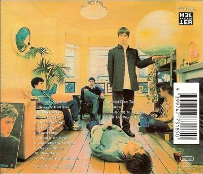
Back
The back of the digipak follows the conventions of most digipaks, by labelling the order of the songs and displaying the artists website, record company, bar code and authorisation of the album. The background, a brick wall, is the same as the background of the front cover and doesn't change at the spine of the digipak, which shows continuity.

Book
The book of this album contains the lyrics of the songs, as well as the people who were involved in the making of the album. In the background of the page the lyrics are are on, we can see the colourful album artwork, which reflect the mood of their respective song.

CD
The CD itself has a different background to the front cover of the album, however it does again state th title of the album as well the record company.

Font design

Bands such as The Sex Pistols and the Rolling Stones, use their font to project their image and attitude across to their audience.


The Sex Pistols
The Sex Pistols use of font resembles the bands image of anarchy and rebellion in the time and there anti-establishment theme. We can see this through their use of improper punctuation, with the capital letters mixed about and the different sizes of the letters, show disorder and a disregard for rules and reinforces the attitudes of the band created from their songs. The torn background reflects an aggressive attitude and mirrors the violent strumming of the guitars and the aggressive vocals from the band them-self.


The Smiths
Similarly, the Smiths font is imposing, stands out with capital letters and, at the same time, shows the normality of the band. The font matches the name of the Smiths, which was intended to show how ordinary the band members if the Smiths were. This font appears on their albums and their merchandise. Again the font of the band matches the image that the Smiths created through their fans and remains true to the audience.


These band use their font on their album covers, for their promotion and for merchandise such as T-shirts and bags. Therefore the font of the band is clearly important as it portrays the bands image to the public, as well as reiterates the bands image and attitude towards their audience, who will express the same values when wearing/using their merchandise.

Target audience

The target audience of our music video will be fans of our band as well as fans of the indie rock genre. The age group of our audience will be teenagers and those in their young 20s, due to people of this age being able to identify with the themes of the rock genre. People who prefer the rock genre to pop genre are more likely to be interested in the music than the music video, therefore the video will have to attract the audience by giving them the following:
  • Several close ups of band members.
  • Narrative or a video which follows the themes of the song.
  • Themes which follow the bands image.
Our primary audience is the those in their late teens and early twenties, as these people are more likely to use websites such as YouTube to watch music videos. Those in their late twenties and early thirties are our secondary audience.
I feel that there should be an emphasis on a live performance in our video as it would reflect the live nature of rock bands who play live concerts. I feel this way as those who attend the concerts will be the people who will watch the music video.

Monday 16 March 2015

Conventions of Digipacks

Digipaks are a type of CD packaging, that were first owned by IMPAC Group, Inc. who were acquired by MeadWestvaco (MWV) in 2000 and then licensed to several manufacturers, leading to the increase in the product internationally.

The typical digipak will have these features:
  • Digipak's will either open as a book would or open to the right and left, having three parts.
  • They will include the CD itself and a small book, which usually includes additional artwork, as well as lyrics for the songs of the album.
  • Unlike most CD's, digipak's are usually made of plastic and cardboard, which although is cheaper, will wear more than a traditional CD case.
  • The digipak will include additional information about the artist, producers record company etc. giving fans a further understanding of the album.
The style of the digipak will reflect the style of the band therefore every aspect of the case is used carefully to create an image true to the artist.

Advantages of the digipak include:
  • They create more design options, as there are more sides than the traditional CD cases and therefore allow for greater creativity for the artists.
  • Digipaks could be more beneficial for the environment, if they are made from recycled material.
  • They also cost less to make than CD cases.
Disadvantages of the digipak include:
  • The digipak will eventually wear and are more likely to become damaged.
  • They also offer less protection than the CD case for the CD and therefore the disk is more susceptible to becoming damaged or scratched.
  • As the disks are not held in place, unlike the CD case, the disk could be more likely to fall out and again, become damaged.